Wednesday, January 19, 2011

Against the Sky

Against_the_Sky
Color by COLOURlovers
Practical_Magic
Color by COLOURlovers
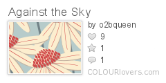
This pattern, Against the Sky by o2bqueen is originally by her and I love it!  I could see it used for alot of things.  I'd personally use it on a pillowcase or curtains.  Definitely a girls design, but I think it's awesome!  I think it would be fun to put on a wall or used for scrapbooking.  All the colors go perfectly with each other.  I could see using the palette for a girls room, but if you take away the pinkish color could really be used for anyone.

Fall

Fall
Color by COLOURlovers
Fall by Mari Abreu original pattern by ambu1959 reminds me of fireworks or if you where to paint while the paper was moving so that all the paint whooshed to one side.  I am unlikely to use it anywhere.  It's a nice pattern but I don't see any practical uses for it. 

Love Back

Love_Back
Color by COLOURlovers
Cultivar_Orchard
Color by COLOURlovers
Love Back by nanochromaddict original pattern by layra96 reminds me of fall.  A nice day in autumn.  The design would be perfect for scrap booking or if you change your room every season.  I would use it everywhere in fall, but I would be unlikely to use it any other time.

Night Whisper

Night_Whisper
Color by COLOURlovers
Spring_Field
Color by COLOURlovers
Night Whisper by DandL original pattern by 60we reminds me of sunflower seeds and the dwarf hamster I used to have (not because the design at all looks like a hamster).  The colors used all work together well.  The main color (the green one) makes me feel comfortable.  I might want to paint my room that color.  I'm not sure why the title of the design is Night Whisper but it also makes me feel at home.

Natural Jute

Natural_Jute
Color by COLOURlovers
Bedroom
Color by COLOURlovers
Natural Jute by Claudio Zeiger looks good.  The original pattern is by o2bqueen.  I think you could use it in a lot of places especially if you're a kid.  I could see it on a basket but maybe that's because of the pattern (it looks like it's weaved).  I could also see it on curtains, but I definitely see it in a kids room.  It could also be the pattern on a lamp shade or comforter for your bed.  The pattern and palette go perfectly together to make a fun design.

Thursday, January 13, 2011

Cactaceous Conefleur

Cactaceous_Conefleur
Color by COLOURlovers
Cactaceous
Color by COLOURlovers
Miss bea heyvin has tons of awesome patterns so I just had to spotlight another one.  This one Cactaceous Conefleur has a sweet pattern and color palette.  I think out of all of the ones I have gone over so far it is my favorite but my favorite color is green so considering its all green I might have swayed.  I can see using it for scrap booking, curtains, and wallpaper.  But I would use it most anywhere.  If a pattern and palette could show who you are this would be mine.

Beautageous Ambu

Beautageous_Ambu
Color by COLOURlovers
Beautageous
Color by COLOURlovers
This pattern is stunning.  It reminds me of leaves in autumn.  Beautageous Ambu was created by miss bea heyvin but originally was by ambu1959.  Not only does it look cool but it gives me a cool feeling.  The colors really complement each other.  Although it is awesome I think the only thing I would use it for would be as a scene saver.  But I could also see it in a kids room, but I'd be worried that the colors would keep me up at night so I'm not really sure.

[t2] Still Bath

[t2]_Still_Bath
Color by COLOURlovers
[t2]_Friendly_Bath
Color by COLOURlovers
The pattern [t2] Still Bath by xwallflower originally by Cenedrae is beautiful, although I'm not sure what I would personally use it for, it could be used as wallpaper.  I could also see it in above the bath in someones bathroom.  Besides that though I can't really see it anywhere, and I personally wouldn't really like to see it anywhere else.  It's not the most adaptable pattern.  I just can't see many uses for this pattern.

Green Tea

Green_Tea
Color by COLOURlovers
This pattern just as the title implies reminds me of green tea (the title is Green Tea).  Not because it is literally green tea but it reminds me and looks kind of like the pattern Arizona Ice Tea has for there green tea.  (If only the flowers where redishpink).  This version was created by ghighi the original pattern was made by Spuidfingers.  It makes me thirsty.  I would use it to promote Iced Tea because that's what it reminds me of, but you could also use it for something like wallpaper.

Winter Home

winter_home
Color by COLOURlovers
emerald_coast
Color by COLOURlovers
This pattern Winter Home by Capricciosa, well I'm not sure if the title fits the picture but either way I like it.  I could see it used for a lot of different things.  You could use it as wallpaper but I could also see it as a shower curtain or as a normal curtain.  The pattern was originally made by miss bea heyvin.  I really love the color palette that goes with the pattern.  All the colors fit perfectly together.  I could see a lot of people using it.  And it has 104 people on colourlover that say they love it.

Tuesday, January 11, 2011

My Old TV

my_old_tv
Color by COLOURlovers
The pattern I found this time was in black and white titled "my old tv" by mdparish originally by isotope.151 and as the title implied it did feel old.  It's the kind of pattern you would see as old wall paper.  I could also see it being but on a wedding invitation.  I think you could use it most anywhere.  Also I could see my great aunt (she's 86 and awesome by the way) using it as the background for her webpage.  It would also be a good pattern for a scrap book or something like that.

Eyes On Me

Eyes_on_Me
Color by COLOURlovers
Creativitycolors
Color by COLOURlovers
When I went to colourlovers I found a cool pattern by meruchan I really liked the colors.  The title was "Eyes on Me" but it reminded me more of waves (I didn't see any eyes). The pattern was originally made by jimmyjames.  I think you could use it in a lot of different ways.  Personally I'd use it for my room at home, the colors (there are only two) aren't too bright.  I'd like to put the pattern on the top part (like the first 9 inches) of the wall stretching all around and then paint the rest of my room the first color in the palette.  But you could also use it as a background for almost anything!  I'd like to see it as a background for someone's blog or something.

Suns

suns
Color by COLOURlovers
cpp293
Color by COLOURlovers
On colourlovers I found this pattern that had a pretty bad palette of colors called "suns" by kaatee to be honest I don't really think it belongs anywhere but right there, it reminded me nothing of what the title implied and then I found out the pattern really wasn't made by kaatee but someone else named colorpie patterns but it didn't look much better in the original black and white.  It might have looked acceptable without the stars on the top and bottom but as is I wouldn't use it anywhere!  Maybe someone around the age of five would use it but I have no idea what for.  In my opinion it is one example of something not to do ever.

Monday, January 10, 2011

What This is About

This blog reviews patterns and palettes from http://www.colourlovers.com/, things like where I would use them and what they could be used for.  I found colourlovers to be able to make some pretty good patterns and palettes it's a great place to get backgrounds.